Les cinq erreurs du débutant qui compose son premier tapis
Composer un tapis sur-mesure suppose de trancher là où le prêt-à-poser décide pour vous. Les cinq erreurs récurrentes du débutant tiennent à la taille, à l'accumulation de couleurs, à l'imitation du décor existant, au manque de contraste et au choix d'un motif déjà daté. Chacune se corrige par une décision simple, prise en amont plutôt qu'au moment du devis.
Le sur-mesure offre une liberté que peu d'objets domestiques autorisent : dimensions, formes, palette, matière, tout se décide. Cette liberté a un revers. Sans les garde-fous d'une collection déjà pensée, le débutant reproduit presque toujours les mêmes cinq erreurs. Elles ne relèvent pas du goût mais de la méthode, et se corrigent avant même de dessiner.
Pourquoi un tapis trop petit rétrécit la pièce
C'est l'erreur la plus fréquente, et la plus tenace. Par prudence, on choisit un format modeste qui flotte au milieu du salon comme un timbre sur une enveloppe. Le résultat morcelle l'espace au lieu de l'unifier : le regard bute sur une île isolée, entourée de sol nu.
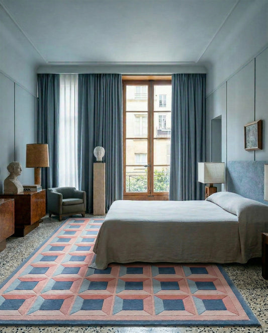
La règle des décorateurs est constante depuis les intérieurs modernistes : le tapis doit accueillir au moins les pieds avant des assises qui l'entourent. Dans une salle à manger, il englobe la table et les chaises reculées, sièges compris. Mesurez l'usage réel, celui des corps et des meubles en mouvement, pas la surface libre au sol. Un tapis généreux fait paraître la pièce plus grande, jamais l'inverse.
Trop de couleurs, et la composition se dissout
La palette est grisante. On veut le bleu du canapé, l'ocre des rideaux, le vert d'une plante, le rose d'un souvenir. À cinq ou six teintes de force égale, le tapis perd sa colonne vertébrale et devient un patchwork sans hiérarchie.
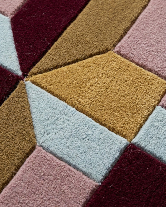
Les grands coloristes du XXe siècle travaillaient par familles restreintes. Josef Albers, au Bauhaus puis au Black Mountain College, a consacré des années à démontrer qu'une couleur ne vaut que par sa voisine : trois teintes justes disent davantage que sept approximatives. Fixez une dominante, une couleur d'accompagnement, une note d'accent. Cette structure à trois voix suffit à porter un tapis entier, comme le prouvent les compositions de la collection Moire, où l'effet moiré naît de variations minimes autour d'un même ton.
Copier le décor plutôt que lui répondre
Deuxième réflexe courant : prélever la couleur exacte du canapé pour le tapis, dans l'idée d'un ensemble coordonné. L'effet obtenu est mou. Les deux surfaces se confondent, le sol remonte dans le mobilier, et rien ne se détache.
Un tapis ne prolonge pas les meubles, il leur donne une assise sur laquelle ils se lisent.
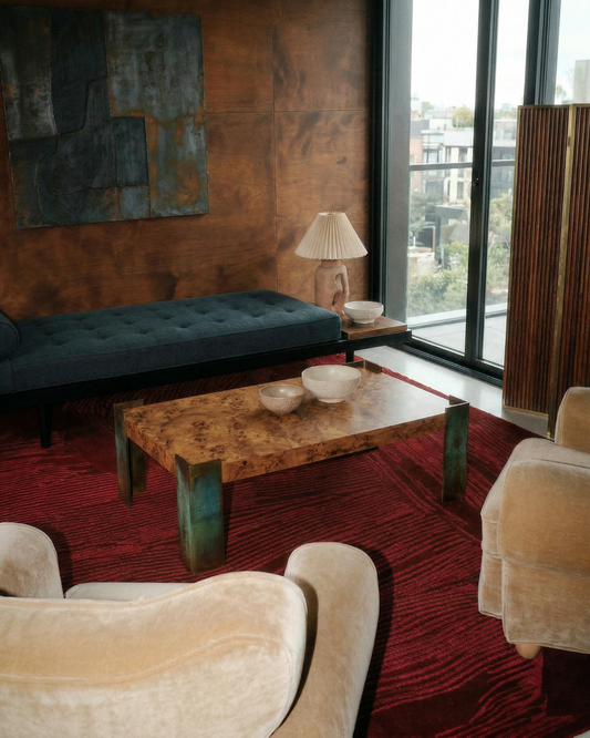
Cherchez plutôt une relation, non une identité. Un canapé écru appelle un sol plus profond, terracotta ou bleu ardoise, qui le fait avancer. Le principe vient de la peinture : un motif se voit grâce à son fond, jamais contre un fond qui lui ressemble. Contrarier légèrement le décor, c'est lui rendre sa lisibilité.
Le contraste, ce que le débutant oublie toujours
Une composition peut être savante et rester illisible faute de contraste. Deux teintes de valeur proche, deux gris moyens par exemple, s'annulent : le motif existe sur l'écran de conception mais disparaît une fois tissé, surtout de loin et sous une lumière rasante.
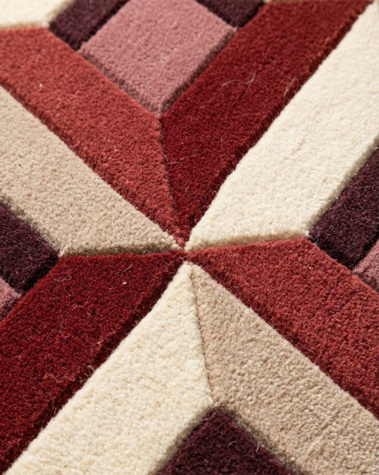
Le contraste ne concerne pas seulement la couleur mais la valeur, c'est-à-dire le rapport clair-obscur. C'est le ressort de l'Op Art : Bridget Riley et Victor Vasarely obtenaient leurs vibrations optiques par des écarts de valeur poussés, souvent le noir et le blanc, avant même la couleur. Pour un tapis à motif graphique, comme ceux d'Optical Palazzo, vérifiez que vos teintes tiennent en photo passée en noir et blanc : si le dessin reste net, le contraste est bon.
Le relief offre une autre forme de contraste, indépendante de la couleur. La technique du carving, qui sculpte la surface en creusant certains niveaux de la laine, crée des ombres portées. La collection La Pintura repose sur ce jeu de profondeurs : un motif ton sur ton y reste visible par la seule variation de hauteur.
Choisir un motif qui datera dans cinq ans
Dernier piège : céder à un effet du moment sans mesurer sa durée de vie. Un tapis se garde des années. Un graphisme trop marqué par une saison précise vieillit vite, non parce qu'il est mauvais, mais parce qu'il est immédiatement identifiable à une année.
La nuance mérite d'être posée : les mouvements historiques, eux, ne datent pas de la même façon. Le postmodernisme du groupe Memphis, fondé par Ettore Sottsass à Milan en 1981, revient régulièrement parce qu'il constitue un langage complet, avec sa grammaire de formes et de couleurs, et non une tendance passagère. La collection Nostalgia Plastica s'y rattache sans en être prisonnière. Préférez un motif ancré dans une culture visuelle durable à une mode dont vous ne saurez plus, dans trois ans, d'où elle venait.
Décider en amont, dialoguer avec l'atelier
Ces cinq corrections ont un point commun : elles se prennent avant le tissage, sur le papier ou l'écran, quand tout reste modifiable. C'est précisément le rôle d'un outil de composition. Le Studio Rugier permet d'essayer une dimension, de réduire une palette, de tester un contraste, puis d'ouvrir le dialogue avec les artisans de Bhadohi qui noueront la pièce à la main. Le sur-mesure devient alors un véritable travail de design, mené pas à pas, où chaque décision se vérifie avant de s'inscrire dans la laine.