Brazilian modernism treated the ground as a surface to be composed: free curves, flat areas of bold color, a design conceived at the scale of the footstep. Roberto Burle Marx in his gardens and Lina Bo Bardi in her architecture turned the drawing on the ground into an art in its own right. This tradition sheds direct light on the contemporary rug, in which organic form and confident color structure a room.
In the mid-20th century, Brazil invented a sunlit version of modernism. Where Europe favored the right angle and the grid, Brazilian architects and landscape designers championed the curve, the tropics and a bold palette. This formal freedom was not an ornamental whim: it stemmed from a desire to link the building, the garden and the ground in a single composition. The ground, precisely, became a place for drawing, treated with as much care as a facade.
To understand this visual culture, one must go back to a simple and fertile idea: a horizontal surface, whether you cross it on foot or look at it from a window above, can carry an entire composition. Paving, mosaic and planted parterres become paintings at the scale of the body. It is this shift of the gaze toward the ground that links, across the decades, the tropical garden to the rug laid in a living room.
Roberto Burle Marx: the garden as painting on the ground
Roberto Burle Marx (1909-1994) is the name that sums up this tradition. Trained in painting before landscape, he conceived his gardens as abstract canvases spread out horizontally. The flower beds form flat areas of color, the paths wind in ample curves, the pools cut out free forms that evoke the biomorphism of Jean Arp or Joan Miró. For him, a plant is not only vegetation: it is a colored material that he composes the way a painter works a palette.
His most famous work remains the Copacabana seafront promenade in Rio de Janeiro, a calçadão of black, white and ochre paving stones that undulates for several kilometers. The motif, taken from the Portuguese tradition of the calçada, is enlarged, energized, transformed into a continuous wave. Here we find the founding intuition of Brazilian modernism: a pattern on the ground can organize public space as powerfully as a monument. The color is clean, the design legible from afar, the form free without ever losing its structure.
This way of thinking of organic form as structure rather than ornament runs through the whole history of Brazilian design, which we explored in our article on Brazilian modernism and the curve that became structure. Burle Marx holds a central place in it: he proves that a curve can hold an entire composition, provided it is drawn with rigor.
Lina Bo Bardi: architecture that frees the ground
Lina Bo Bardi (1914-1992), an Italian-born architect who settled in Brazil after the war, extended this attention to the ground by other means. At the São Paulo Museum of Art (MASP), completed in 1968, she suspended the main volume between two red pillars and freed a vast belvedere at street level. The ground gains a new status: it is no longer a mere support, it becomes an open space, offered, breathing. Her bright red, applied without timidity to the structure, asserts that bold color belongs fully to the architectural vocabulary.
At SESC Pompéia, a former factory converted into a cultural center, Bo Bardi kept the raw floors and added irregular slabs, sinuous pools and paths that follow the real use of bodies. Her approach is popular, material, attentive to daily life. She shares with Burle Marx this conviction: the ground is lived in, crossed, drawn, and it deserves thinking as ambitious as the walls do.
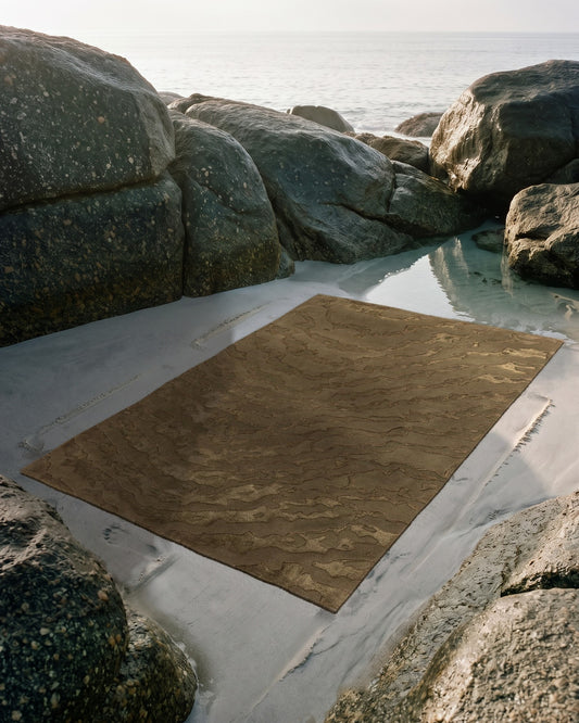
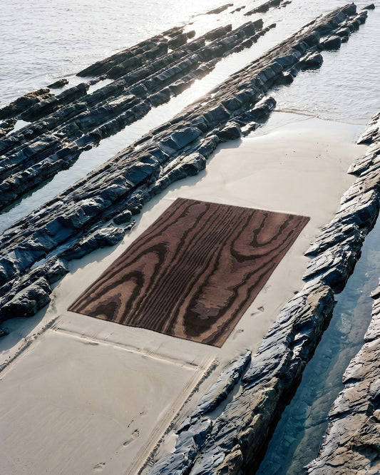
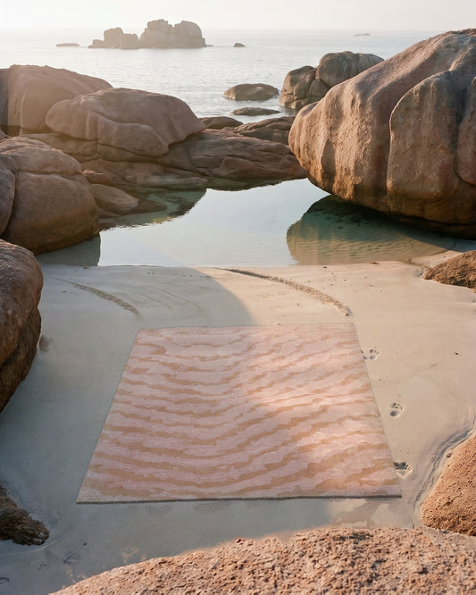
What Brazilian modernism leaves behind is a grammar: saturated colors used in flat areas, organic forms drawn with precision, a composition designed for the moving gaze. This grammar transposes naturally to the rug, a colored surface laid on the floor that we take in with our eyes and our steps. The Moire collection, with its ripples that seem to move with the viewing angle, converses with this idea of a living surface: on this subject, see our article on the origin of the moiré effect.
The Brazilian lesson also touches on the question of color itself. Using a red, a yellow or a green as a flat area requires accuracy: you must hold the tone without dulling it, and match it to the light of the room and to the other surfaces. That is the whole subject of our article on choosing a palette in Studio Rugier, where color theory becomes a practical tool at the moment of composing.
From the drawing on the ground to the hand-tufted rug
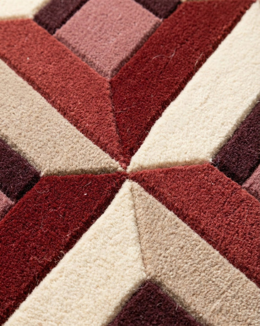
In the Bhadohi workshop, free form and bold color find a medium equal to them. The hand-tufted rug allows sinuous contours, clean flat areas and precise transitions between colors, because the wool strand is set point by point following a controlled design. New Zealand wool, dense and consistent, renders color with a depth that landscape designers were already seeking in their flower beds. Sculpted relief, or carving, even makes it possible to create a hierarchy of forms, just as Burle Marx played with the heights of plants.
Composing a rug in this spirit means taking up the landscape designer's gesture at the scale of a room: drawing a form that organizes space, choosing a color that gives it presence, designing the whole for the eye and for the step. Studio Rugier lets you compose your custom rug by working precisely on these parameters, from form to tone. To go further, our article on how to start from the rug to compose an entire room extends this idea that the floor governs space, exactly as Burle Marx and Lina Bo Bardi taught.