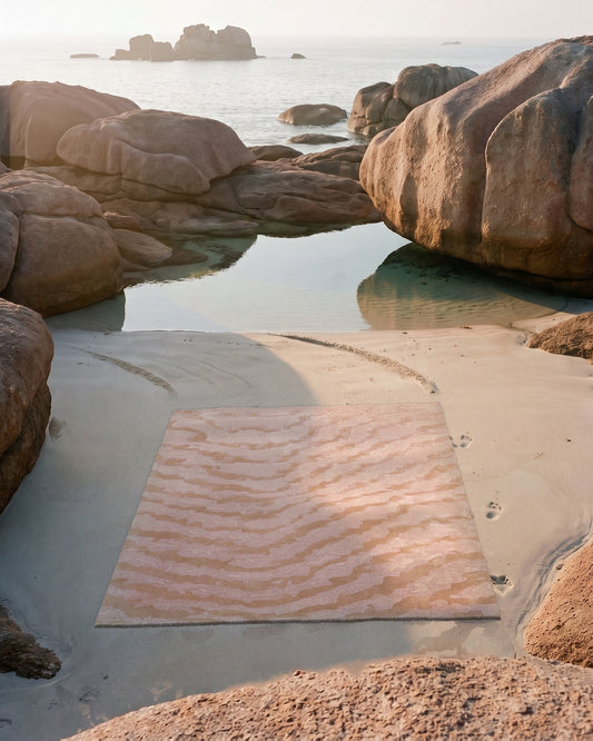
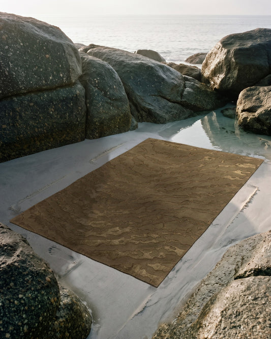
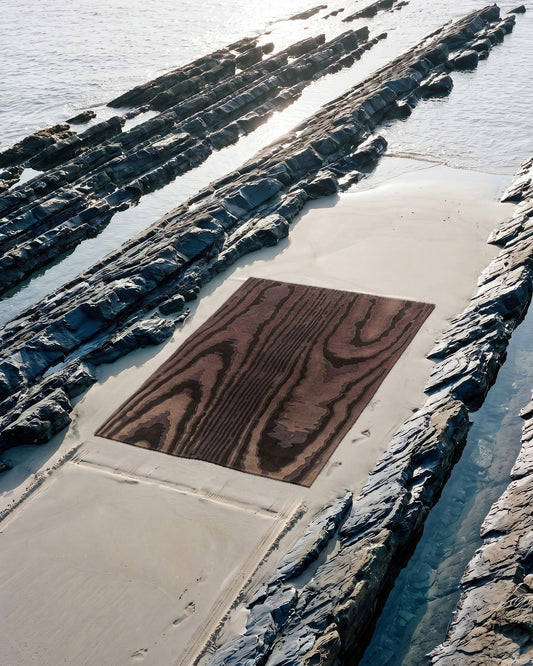
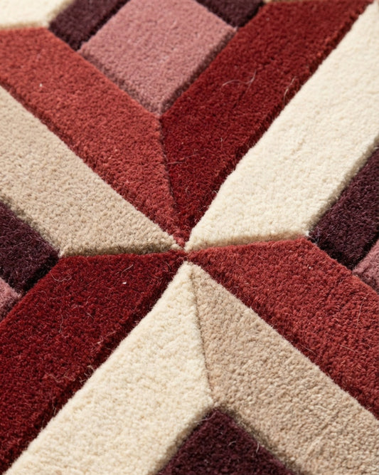
A tone-on-tone composition plays a single hue across several values, from the lightest to the deepest. On a rug, these variations give relief to the pattern without multiplying colors and establish a stable harmony in the room. In Studio Rugier, composing tone-on-tone means choosing a color, then exploring its degrees.
The term tone-on-tone, camaïeu in French, refers to a composition based on the variations of a single color, obtained by playing on the lightness, saturation and density of the hue. We speak of tone-on-tone blues, greens or earth tones: a single color family explored by degrees, from the palest veil to the darkest note. In painting, the camaïeu technique was once used to imitate sculpted relief, modeling volume through the gradation of a single tone alone. This is exactly what a rug can do on the floor.
Composing around a single color does not impoverish a room, quite the opposite. The constraint forces you to work with material, scale and light rather than piling up contrasts. A successful tone-on-tone can be looked at for a long time without tiring, because it reveals its nuances gradually, with the time of day and the viewing angle. This slow discovery is precisely what distinguishes a lasting piece from a simple decorative flat area.
Why a single hue gives relief to a pattern
A geometric or organic pattern is read first through its differences in value, that is, the difference between light areas and dark areas. In tone-on-tone, these differences are narrowed within a single color, which softens the transitions and gives the impression that the design emerges from the surface rather than being laid on it. The result evokes a bas-relief: the pattern is there, but it breathes.
This logic is close to that of the Moire collection, where the ripple arises from a gradient of close tones that seems to move with your gaze. We have detailed this phenomenon in an article devoted to the origin of the moiré effect: the vibration comes less from the design than from the way neighboring values overlap to the eye. A rug like Agata rests entirely on this principle of controlled gradation.
The material amplifies the effect further. Wool absorbs light and holds deep tones, while silk reflects it and makes the light values sing. Mixing the two in the same tone-on-tone creates differences in sheen that double the differences in hue: an area of dark wool and an area of lighter silk, in the same color, are enough to draw an entire pattern.
The role of carving in a monochrome rug
When the color no longer varies, relief takes over. Carving, the technique of sculpting the surface of the rug by cutting the contours at different heights, draws cast shadows that structure the composition. On a monochrome piece, this play of shadow becomes a second design, invisible from afar, obvious under raking light.
We explain this craft in our article on carving and sculpted relief in wool. Applied to tone-on-tone, it transforms a flat gradation into a true topography. The La Pintura collection draws on this vocabulary of relief, where the pattern is read by touch as much as by eye.
Composing your tone-on-tone in Studio Rugier
In Studio Rugier, composing tone-on-tone starts with choosing a reference color, then selecting its variations. It helps to think in three or four distinct values: a middle tone that will give the piece its character, a lighter value to open up the composition, a darker value to anchor it. Too many shades that are too close blur together in the rug; too few and the effect of depth disappears.
Custom work allows a precision here that is impossible to find in off-the-shelf rugs. You match the hue to a wall, a wood, a particular light. Our articles on choosing a palette according to color theory and on matching a rug to the light of a room detail the approach: the same hue behaves differently facing north, exposed to cool, constant light, or facing south, under warm, changing light.
Tone-on-tone does not reduce the choices, it shifts them: the question is no longer which color to pair, but how far to push a single hue.
The composition approved in the Studio then becomes a blueprint for the workshop in Bhadohi, where the rugs are hand-tufted with a needle. Each value of the tone-on-tone corresponds to a wool or silk yarn selected from the color chart, then transferred strand by strand onto the stretched cloth. This dialogue between the digital design and the artisan's hand is at the heart of our manufacturing craftsmanship, and we have told its story in an article on the dialogue with the tufters of Bhadohi.
What tone-on-tone brings to the harmony of an interior
In a room, a tone-on-tone rug acts as a binder. Its narrow range makes it compatible with varied furniture, because it does not impose a violent contrast that would force the rest of the room to fall into line. It establishes an overall tonality, a color atmosphere in which the other elements settle without clashing.
This flexibility makes it an excellent starting point for composing an entire room, as we discuss when starting from the floor to organize the rest. A tone-on-tone of earth tones warms a light interior; a tone-on-tone of grays calms a very colorful space. It then remains to adjust the scale of the pattern to the available surface, a subject we cover in our article on pattern scale according to room size: a broad gradient breathes in a large living room, while a fine gradation suits a more intimate space. Composing around a single color means giving yourself the means for a lasting harmony, patiently built value after value.