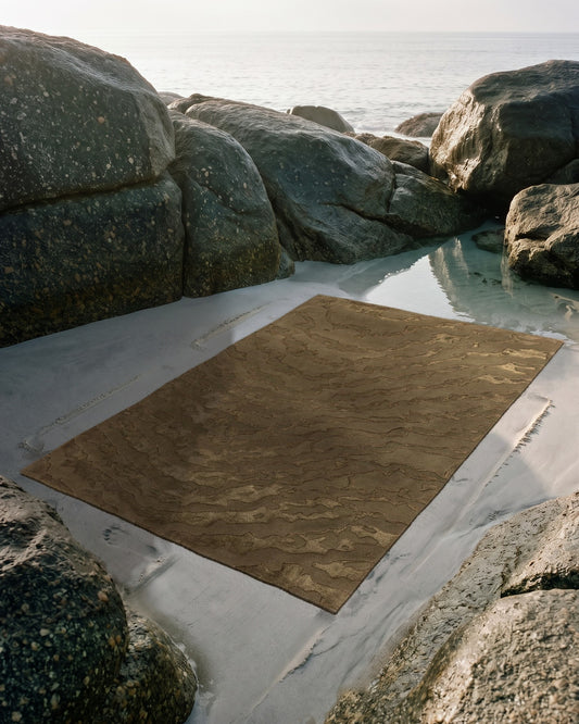
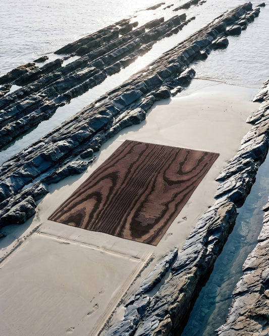
The color of a rug never exists on its own: it depends on the light that reveals it. A wool looks warmer in a south-facing room and grayer facing north, and silk changes shade with the viewing angle. Composing a custom rug means observing your room at different times of day before settling on a palette.
A rug is rarely chosen in the light in which it will live. You look at it on a screen, in a showroom, under neutral lighting, then you unroll it at home and the color seems to have shifted slightly. There is nothing abnormal about this gap. The shade of a fiber is the product of an encounter between a pigment and a light source, and that source varies from one room to another, from one hour to the next, from one season to the next.
Understanding this mechanism changes the way you compose a custom rug. Before setting a palette in the configurator, it is worth observing your room the way a photographer observes a set: where the light comes from, at what temperature, and what it does to the materials already present.
Why the orientation of a room changes a color
Daylight does not have the same temperature depending on the cardinal direction a window faces. A south-facing room receives abundant, rather warm light, which accentuates yellows, ochers and reds. A north-facing exposure, by contrast, gives a cool, constant light with no direct sun, which pulls colors toward gray and blue. Warm tones look more muted there, cool tones sharper.
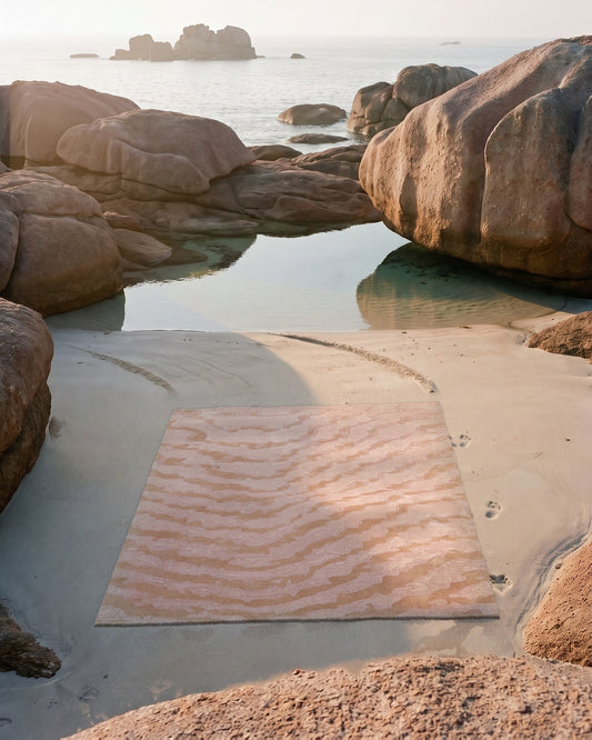
East-facing rooms enjoy bright light in the morning and then a softer atmosphere in the afternoon, while west-facing rooms reverse this pattern, with golden late-day light that strongly warms surfaces. The same pinkish-beige wool may thus look distinctly warm at sunset and almost neutral in the morning. This is why it is useful to photograph a color sample or an inspiration at several moments before deciding.
Wool and silk do not react to light in the same way
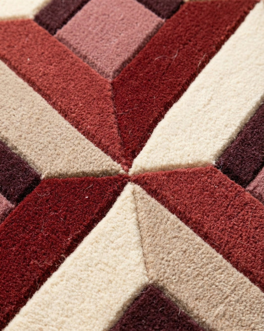
In a hand-tufted rug, New Zealand wool and silk do not return light in the same way, and it is precisely this contrast that gives a composition its relief. Wool has a matte, slightly irregular surface that diffuses light in all directions. Its color therefore remains stable as you move around the rug: it absorbs rather than reflects.
Silk, on the other hand, reflects light directionally. Depending on the angle from which you look at it and where the source is, the same area of silk looks light or dark, brighter or deeper. This is the principle of shimmer, found in silk velvets and antique taffetas. On a rug, a line or a motif drawn in silk will seem to change shade as you cross the room, animating the surface as you move.
Wool holds the color in place and silk lets it breathe: playing with their proportions means deciding how much light moves through a rug.
This difference has a concrete consequence at the moment of composing. Reserving silk for the details you want to see vibrate, such as a line, a flat area of color or the background of a motif, makes it possible to use light as an element of the design. The Moire collection, which rests entirely on moiré and depth effects, takes advantage of precisely this ability of silk to modulate shade with the angle.
Artificial light, a second palette to anticipate
A room lives as much in the evening as in broad daylight, and artificial lighting has its own temperature, measured in kelvins. A warm-light bulb, around 2,700 kelvins, brings the atmosphere closer to candlelight and flatters reds, earth tones and browns. A neutral or cool light, above 4,000 kelvins, renders colors more faithfully but can harden warm tones and dull certain reds.
Another criterion matters, one that is often overlooked: the color rendering index, or CRI. It measures a light source's ability to render shades faithfully compared with daylight. A high CRI, close to 90, preserves the richness of a palette; a low CRI flattens nuances and can turn a deep green toward brown. For a rug whose color harmonies have been carefully worked out, the quality of the bulbs matters as much as their number.
Composing the right palette in Studio Rugier
Custom work makes it possible to build these observations into the design from the start, rather than putting up with them once the rug is laid. In Studio Rugier, you choose the shapes, the colors, the balance between wool and silk, and the dimensions. This is the ideal moment to translate what the room has revealed: a north-facing exposure will invite you to warm the palette slightly, while a very golden west light will instead justify more neutral tones that will not tip into orange every evening.
It is wise to compare your composition in the light where the rug will live, and not only under the light of a screen, which makes colors more saturated than they will be in wool. Placing a draft palette near the window in question and observing it in the morning and in the evening helps identify the shades likely to drift closer together or merge depending on the time of day.
Finally, custom work opens a dialogue with the Bhadohi workshop, where each rug is hand-tufted. Specifying the orientation of a room, or the presence of a large picture window or of predominantly warm lighting, is not a decorative detail: it is information that guides the choice of fibers and the place given to silk. A rug designed for its light keeps its balance from daybreak to the evening lamp, instead of looking right at only one hour of the day.