Harmonizing the colors of a rug rests on a few stable principles: the temperature of the hues, the degree of contrast, the choice between tone-on-tone and complementary colors. These reference points, inherited from color theory, turn an intuition into a decision. In Studio Rugier, they guide every custom composition.
Faced with an open palette, the first reflex is often to look for the color you like. The second, more useful one, is to understand how colors behave with one another. A rug is not a flat surface placed in a void: it interacts with the light of a room, with the wood of a floor, with the fabric of a sofa. The colors that make it up react to one another, and this interaction follows rules that have long been known.
Color theory is not an academic constraint. It is a set of verifiable observations, formalized over the centuries by painters, physicists and educators, that describe the way the eye perceives relationships between colors. Knowing them when composing in Studio Rugier lets you choose deliberately rather than by trial and error.
The color wheel, a tool with a history
The idea of arranging colors in a circle goes back to Isaac Newton, who split white light with a prism in 1666 and closed the spectrum on itself to represent the continuity of hues. In the nineteenth century, the chemist Michel-Eugène Chevreul, director of dyeing at the Gobelins Manufactory, took a decisive step. While trying to understand why certain wools looked dull once woven, he discovered that the problem came not from the pigments but from what surrounded them.
Chevreul then formulated the law of simultaneous contrast: a color alters the perception of the one beside it. A gray looks warmer next to a blue, cooler next to an orange. This discovery, made in a tapestry workshop, remains the most concrete foundation for anyone composing a rug. Every color you place influences how its neighbor is read.
Temperature: warm, cool and the balance between the two
The most useful distinction at the outset is temperature. Reds, oranges and yellows advance toward the eye and warm up a room; blues, greens and purples recede and calm it. This perception is not a cultural convention: it stems from the way our visual system ranks wavelengths.
A rug with a warm dominant makes the space feel denser and brings the walls closer, which suits a large, somewhat cold room facing north. A cool dominant, on the contrary, expands the volume and suits sun-drenched spaces. Most successful compositions are not monochrome in temperature: they rest on a clear dominant, warmed or cooled by a touch of the opposite family, which gives the whole composition depth.
Tone-on-tone or complementaries: two approaches to harmony
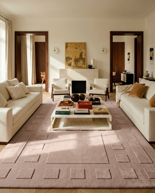
Two main strategies structure a palette. The first, tone-on-tone, plays a single hue through variations of lightness and saturation: several blues, from sky to slate, or a range of terracottas. The harmony is soft, enveloping, and highlights the material more than the pattern. It is the ideal route for a rug that needs to blend into an interior that is already busy.
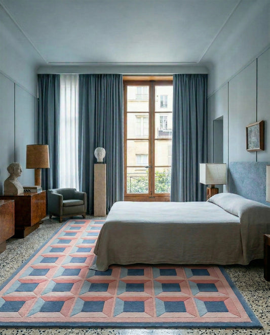
The second strategy calls on complementary colors, those that face each other on the color wheel: blue and orange, red and green, yellow and purple. Placed side by side, they intensify each other and produce maximum vibration. This is the driving force of Op Art, which Bridget Riley and Victor Vasarely exploited to make the surface tremble, and one of the principles of the Optical Palazzo collection. This energy needs to be measured out: a complementary pairing at full strength quickly becomes tiring, while a muted version, in which one of the two colors is softened, keeps the contrast without the aggressiveness.
The role of contrast and neutral tones
Contrast concerns not only hue but also value, that is, the relationship between light and dark. A rug can use only one color and remain dynamic if the difference in value is strong. Conversely, two vivid colors of identical value compete for attention and blur the design. Setting the values first, even before the colors, often clarifies a composition that was resisting.
Neutrals, finally, are the discreet allies of any palette. The ecru of wool, a tinted gray, a pinkish beige or a charcoal act as breathing space between saturated colors. The Bauhaus and modernist interiors made skillful use of them: a neutral framework that lets a single bold color speak. On a rug, these calm grounds prevent saturation and give the eye a point of rest.
From theory to material
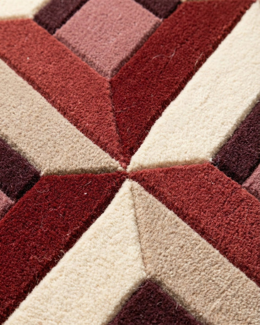
Color never exists independently of its medium. New Zealand wool, matte and dense, absorbs light and softens colors; silk, with its luster, reflects it and intensifies nuances depending on the viewing angle. The same color in these two materials does not read the same way, and the interplay between matte and shiny areas is in itself a contrast, independent of the choice of color.
This is where custom composition takes on its full meaning. Choosing a palette in Studio Rugier means weighing these variables while keeping in mind where the rug will go, the light of the room and the materials around it. The principles set out here do not dictate a result: they provide a vocabulary for deciding, then for a dialogue with the artisans of Bhadohi who will translate these choices into hand-tufted wool and silk.