De Stijl was born in the Netherlands in 1917 around a magazine founded by Theo van Doesburg. The movement reduces composition to three primary colors, to black, white and gray, to horizontal and vertical lines, and to a balance achieved through asymmetry. This geometric grammar remains one of the most fertile matrices of modern design, including in rugs.
1917: a magazine, a manifesto, a country on the sidelines of the war
In October 1917, the painter and theorist Theo van Doesburg launched a magazine in Leiden titled De Stijl, literally “the style.” The Netherlands, which had remained neutral during the First World War, offered a sheltered space where a few artists reflected on a complete refoundation of the visual arts. Around Van Doesburg gathered the painter Piet Mondrian, the architect Gerrit Rietveld, the Hungarian painter Vilmos Huszár and the designer Bart van der Leck.
The project was not only pictorial. The aim was to define a universal visual language, free of any national particularism, any ornament, any anecdote. This language was meant to apply to painting as well as to architecture, furniture and typography. The magazine, published until 1928, was the theoretical laboratory for this ambition.
The principles: three colors, two directions, one balance
The grammar of De Stijl comes down to a few very clear-cut rules. The palette is limited to the three primary colors (red, yellow and blue), to which are added the three “non-colors”: black, white and gray. Lines are exclusively horizontal and vertical, forming right angles. Any curve, any diagonal, any illusionistic modeling is ruled out.
Mondrian called this pursuit Neoplasticism. His idea: to reach harmony not through symmetry, which repeats and freezes, but through a balance between unequal elements. A large white plane can be held in tension by a small red rectangle placed in a corner. Composition becomes a matter of relationships, of visual weights, of intervals between the black lines that structure the surface.
“The new spirit must manifest itself in everything that touches life,” wrote Van Doesburg, who wanted to see this geometric clarity reach walls, furniture and everyday objects.
A founding divergence: the straight line and the diagonal
The movement was never a homogeneous bloc. In 1924, Van Doesburg introduced oblique lines into his compositions, which he named “Elementarism,” convinced that the diagonal brought a modern dynamism. Mondrian saw this as a betrayal of the founding principles and left the group. This rupture sheds light on what was at stake: for Mondrian, strict orthogonality was not a formal constraint but a condition of the universal balance he was seeking.
This episode is a reminder that the geometry of De Stijl was not a mere decorative repertoire. It carried a worldview, almost an ethic of clarity. The Red and Blue Chair designed by Rietveld in 1918, then his Schröder House in Utrecht, completed in 1924, translated these ideas into lived space: colored planes, perpendicular uprights, movable partitions.
From painting to object: a legacy that spans the 20th century
The influence of De Stijl quickly extended beyond the borders of the Netherlands. Van Doesburg taught in the orbit of the Bauhaus in the early 1920s, and the vocabulary of the grid, flat areas of color and primary colors left a lasting mark on the German school, then on international graphic design. Its traces can be found in typography, posters, postwar architecture and even fashion design.
What makes this grammar so enduring is its capacity to be transposed. A system based on straight lines, clean surfaces and a restricted palette lends itself to every scale and every material. It reads as well on a facade as on a page or on a textile. The rug, the flat surface par excellence, is a natural terrain for it.
The De Stijl grid on the floor: how the rug takes it up
The contemporary rug inherits this lesson in composition in an almost self-evident way. A tufted surface is already an orthogonal plane, structured by the weft and the warp. Deploying a rhythm of black lines and colored fields across it amounts to rediscovering Mondrian's very gesture, transposed into wool and silk. Asymmetrical balance takes on a concrete meaning here: in a room, the rug anchors the space without closing it off, playing on unequal masses.
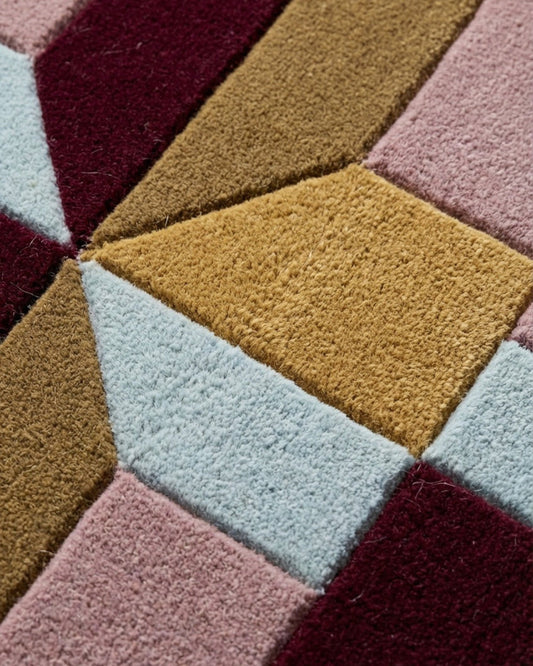
The hand-tufting technique allows precisely this work of bold flat areas and clean lines. In our workshops in Bhadohi, New Zealand wool gives the colored surfaces a matte depth, while silk can highlight an accent, a rectangle, a line. The contrast between these materials makes the composition vibrate, where on paper it would remain purely graphic.
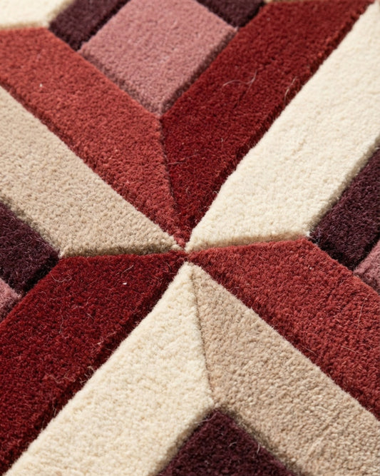
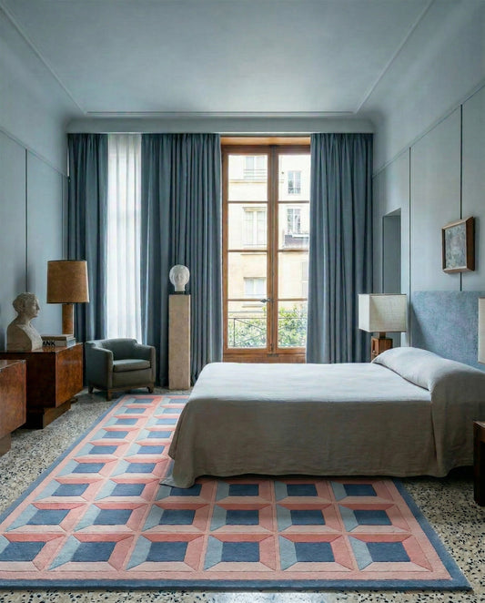
Our Optical Palazzo collection draws on this geometric lineage, the one that runs from De Stijl to Op Art, working with the grid, rhythm and the tension of colors. Understanding the principles formulated in Leiden in 1917 helps you look at these rugs differently: every interval between two lines, every proportion of a colored field, extends a century-old reflection on balance and clarity. The lesson of Mondrian and Van Doesburg has lost none of its relevance: reducing to the essentials remains one of the most demanding exercises in design.